L3HArris
Improving The L3Harris Flight Simulator Experience
Overview
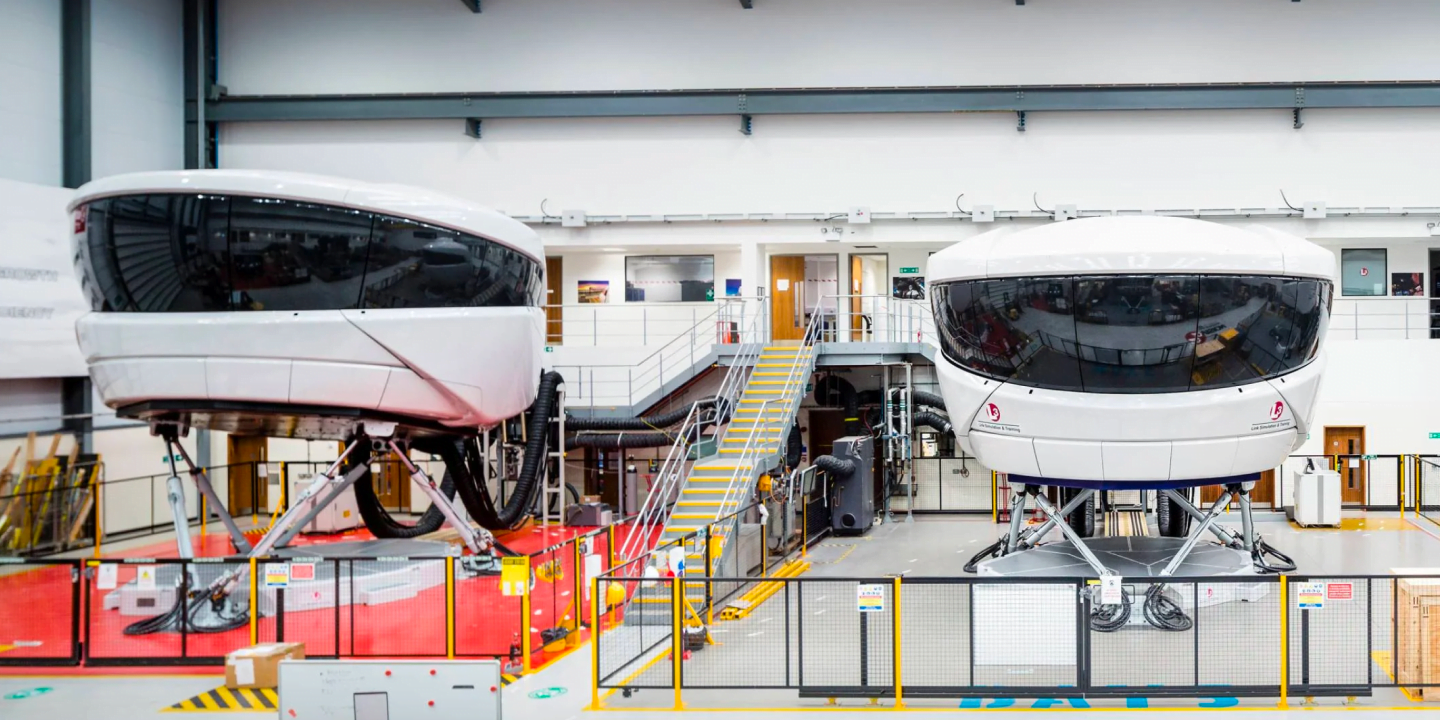
L3Harris design and build flight simulators for the global aviation industry. Combining cutting-edge technology and modern design, they provide an invaluable training service for commercial airlines and flight training centers around the world.
But a clunky training interface in the simulators was getting in the way, causing flight instructors unnecessary frustration and time.
Client
L3Harris
Industry
Aviation
Length
12 Weeks
Activities
- UX Audit
- In-field User Research
- Low-fi Wireframes / Prototyping
- User Testing
- High Fidelity Designs
- Versatile Component Library

Deep Immersion & Field Research
To understand the specialist subject matter, we immersed ourselves in the world of aviation, and spent two weeks on site conducting in-field research:
- Observed 20+ hours of in-SIM flight training
- Reviewed & evaluated the existing user interface
- Identified key users, tasks and priorities
- Conducted user interviews, workshops and ethnographic observation
- Created personas and user stories

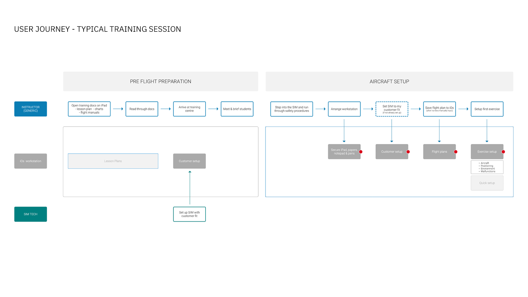
Mapping user journeys
We began by defining the foundations of intuitive new user flows and journeys, addressing the most important tasks as well as being emphatic to the physical challenges presented by the cabin environment.
- Information architecture based on user needs and behaviour
- Identified key tasks and scenarios to address
- Simplified user journeys with fewer steps and less jargon
- Designed a new navigation system designed around the user not the technology
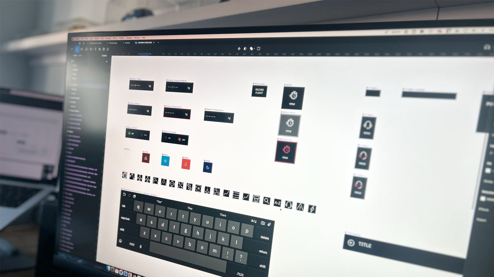
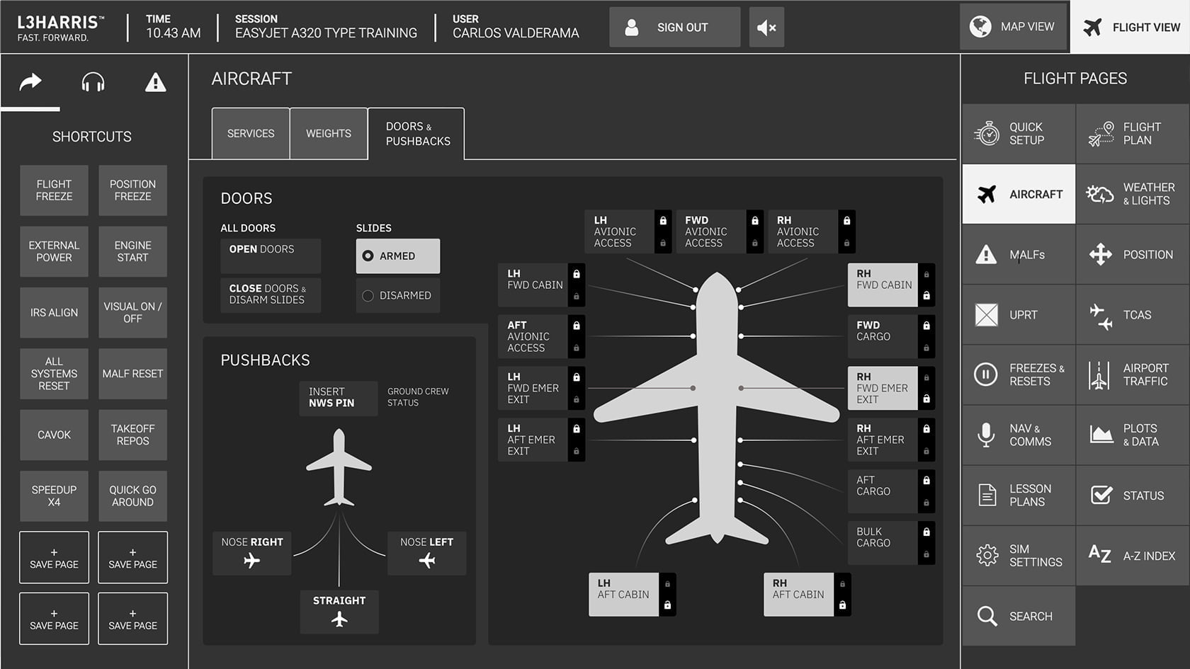
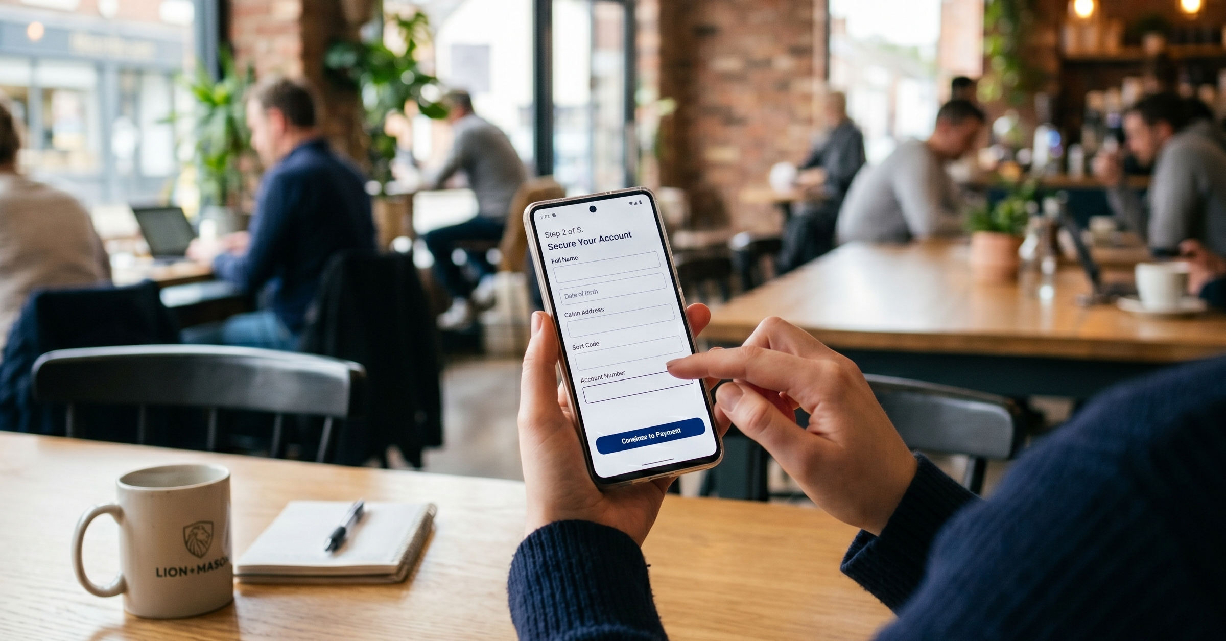
Versatile Component Library
We created a UI design layer that reflected L3Harris’s brand values and complemented our UX design recommendations:
- Built a simple but versatile component library of buttons, tables, switches, and dials that control all features and functionality
- Employed a flat design aesthetic prioritising visual clarity and ease of use
- Created a dark colour palette optimised for low light environments
- Prioritised a clean look and feel for maximum readability and comprehension
- Liaised closely with the technical team to ensure validity


Flexible Testing Strategy
We implemented a flexible testing strategy – ensuring feedback from a variety of users in different locations was captured in a consistent format.
- Inclusive survey design and tone of voice to maximise comprehension and completion rates across EU regions
- Quantitative and qualitative feedback with follow up interviews
- Remote testing strategy sympathetic to user’s environment and device preferences
- Comprehensive qualitative and quantitative data analysis

“LION+MASON delivered a well-considered product within a very ambitious timescale. They really opened our eyes as to what is valuable to our end-users, and the feedback has been very positive… We’re looking forward to seeing what future iterations will bring.”
The latest insights on UX, UI & Product Design

How understanding user behaviour de-risks legacy product modernisation
The High-Stakes Bet: Beyond the Technical Migration Most businesses eventually reach a point where their core legacy product becomes a bottleneck. Whether it is a back-office tool slowing down operations or a customer-facing SaaS platform losing its competitive edge, the need for modernisation is clear. At this stage, leadership teams usually view the project through…
Why Asking Too Much Too Soon Is Killing Your Conversion
A perfectly functional sign-up journey is no guarantee of a successful product. We often see organisations invest heavily in ensuring a journey is usable, yet they are left wondering why their conversion rates remain stagnant. The issue is rarely that the user cannot complete the task: it is that they have reached a point where…